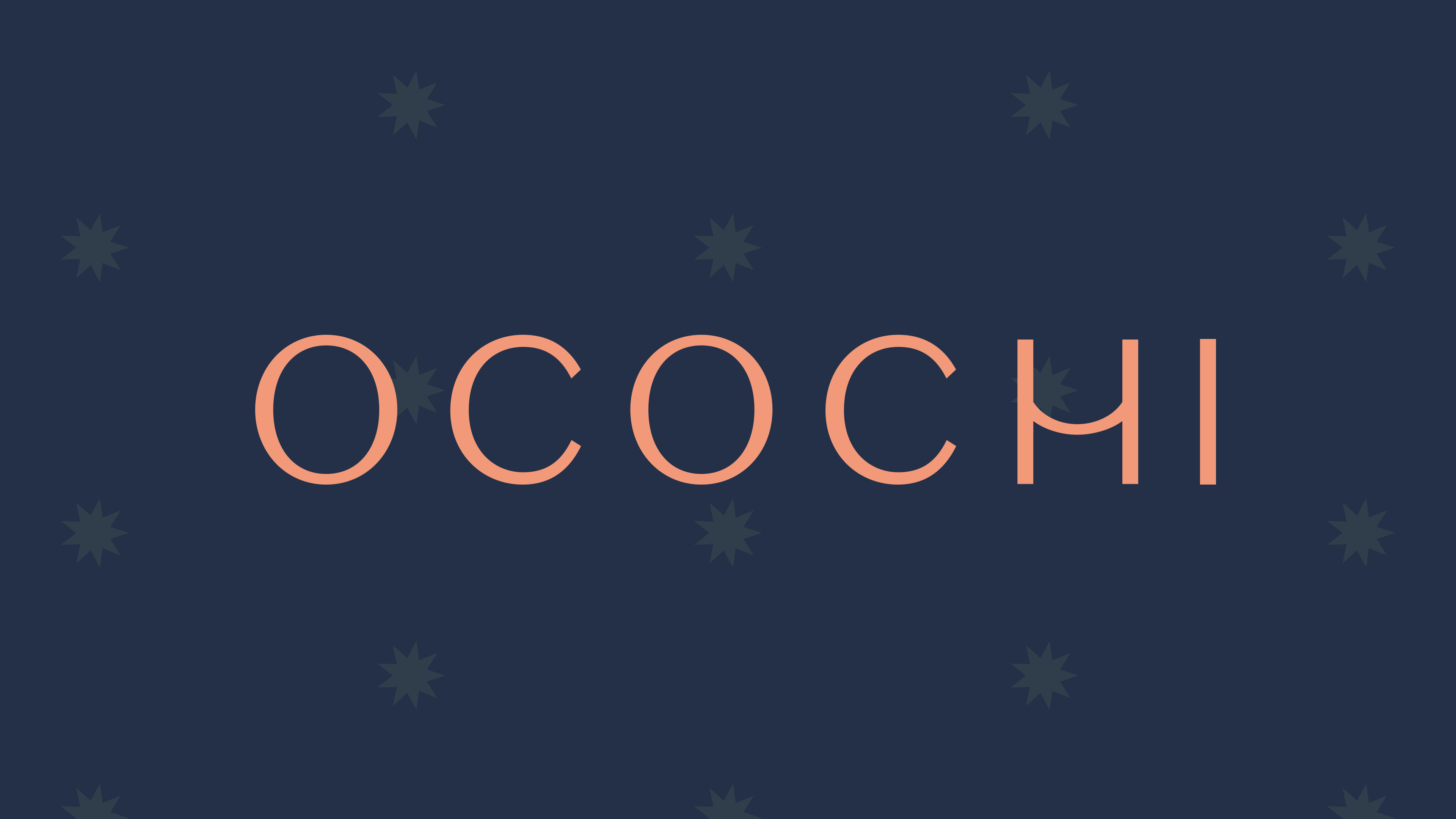
Ocochi Bedding & Fabrics
—Brand Identity
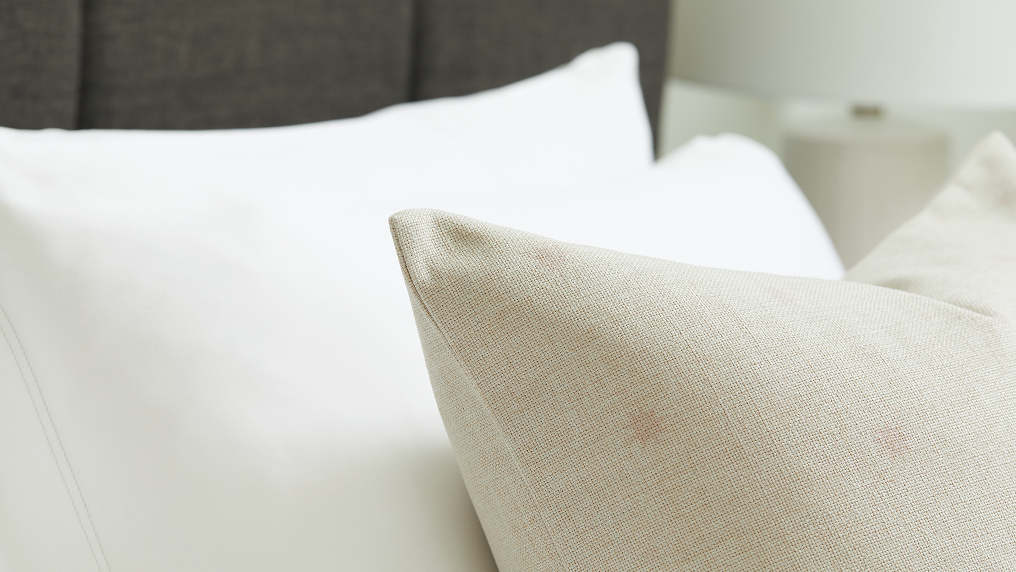
Ocochi is a unique fabric and bedding startup that leverages the myriad physical and environmental benefits of bamboo fiber as a material for bedding. Ocochi was positioned within an eco-luxury space to stand out in a market saturated with DTC disruptors that all look and sound the same.
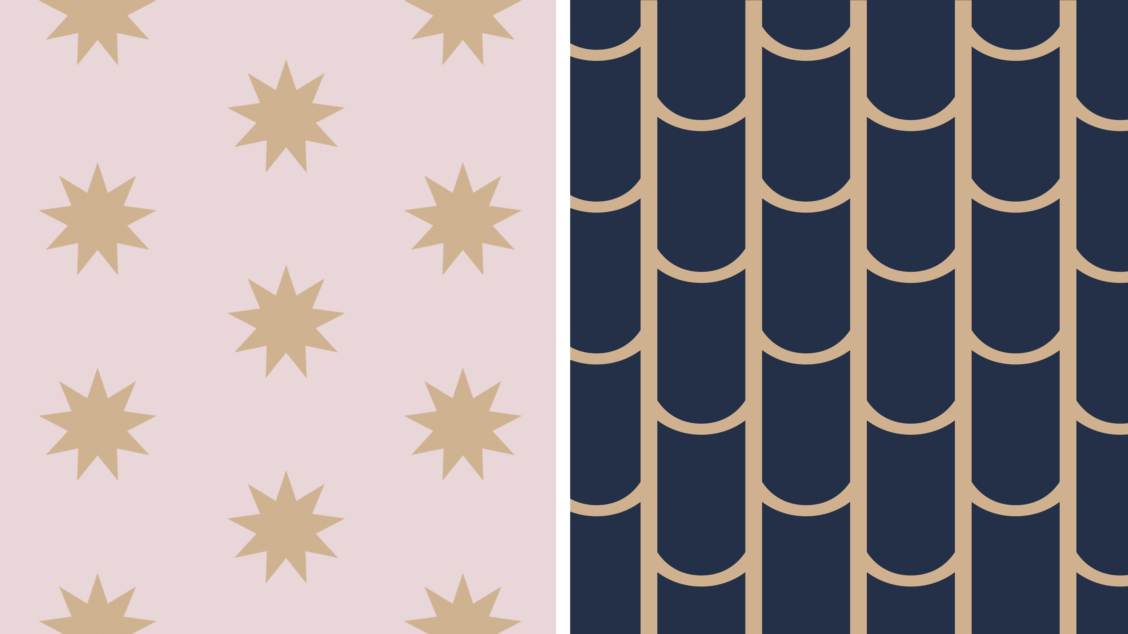
The visual identity playfully uses the simple custom bowed ‘H’ which reveals itself to be a modular illustration of a bamboo chute. This subtle adjustment, combined with soft colors, and geometric patterns give the brand a balance of luxury and approachability.
The visual identity playfully uses the simple custom bowed ‘H’ which reveals itself to be a modular illustration of a bamboo chute. This subtle adjustment, combined with soft colors, and geometric patterns give the brand a balance of luxury and approachability.
The intention with the Ocochi logotype was to focus on the brand name itself—being a newcomer to the industry and having chosen a curious name, the written mark felt natural. This tempered the necessity for something that relied to heavily on literal imagery. The result is a bit more effortless, allowing for the brand to be understated. The adjusted ‘H’ in this case is more stylistic, however, once it is expanded into the brand’s signature pattern, the bamboo image becomes clear. This larger visual system gives the brand an ability to oscilate between elevated and playful.

Though not initially part of the project scope, patterns became a featured design elements on a set of pillows also carried by Ocochi. These patterns helped to develop a visual language for the brand that meshes well with their target markets everyday design aesthetic.