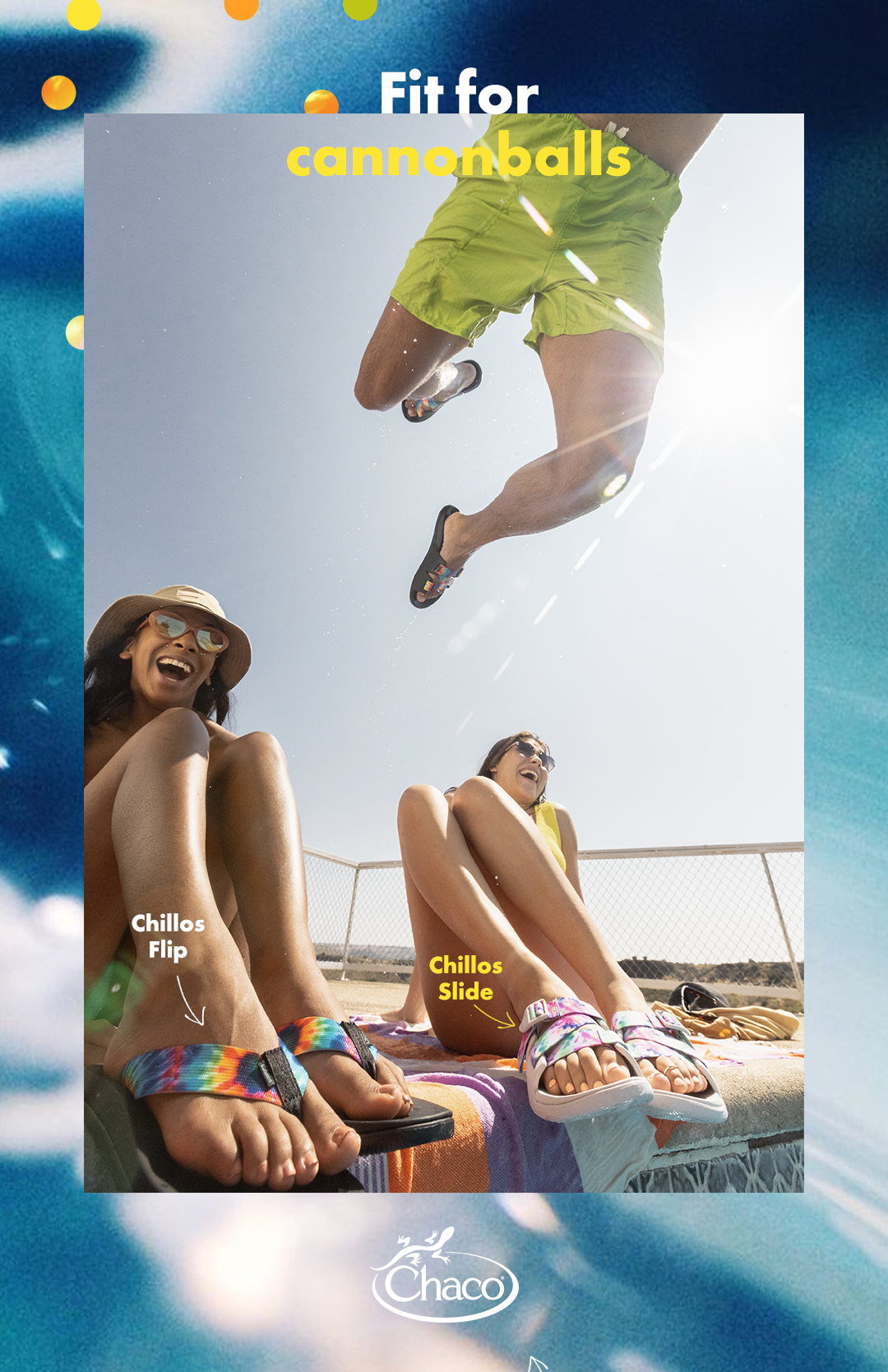
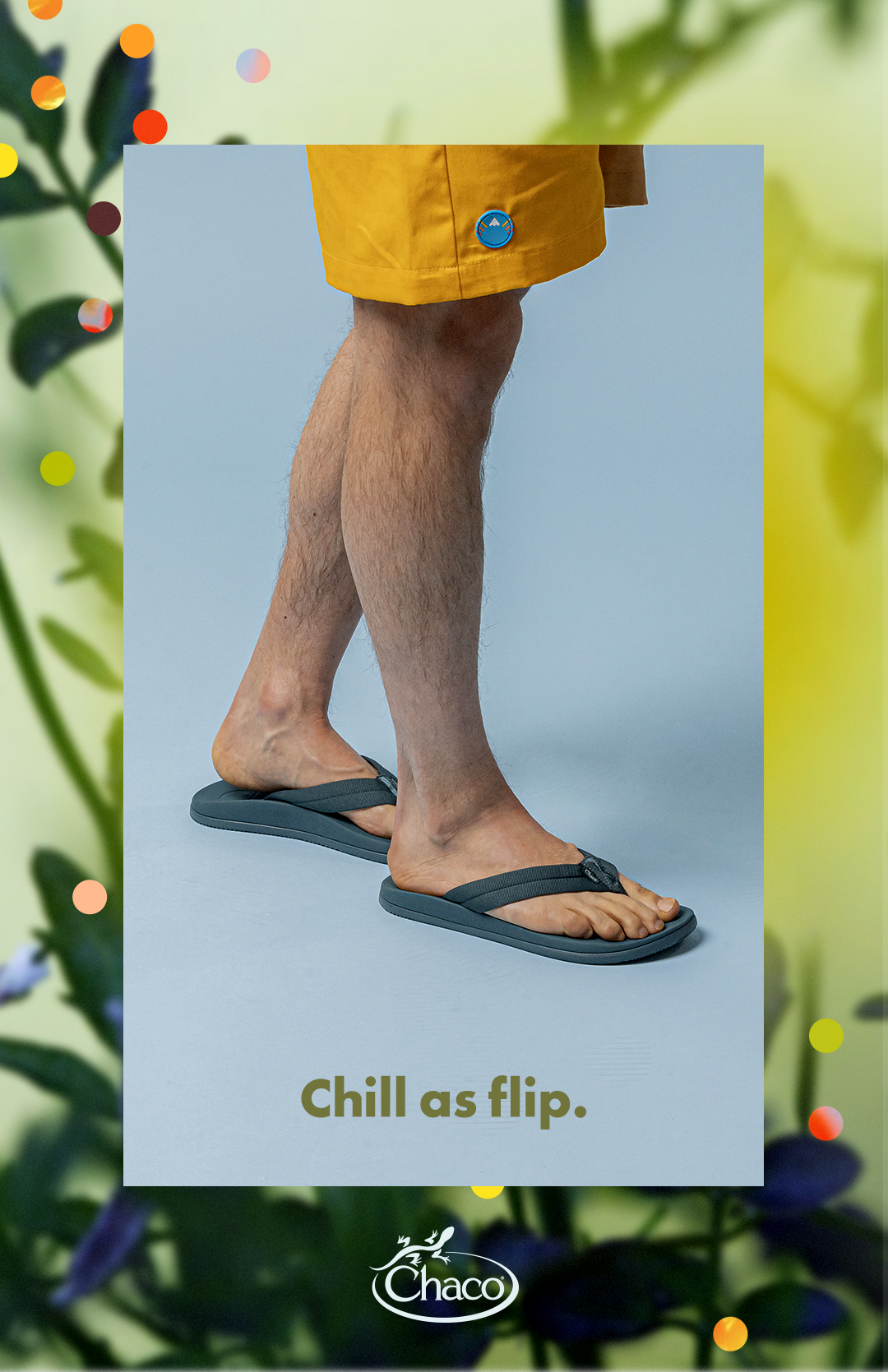
Chaco Footwear—
Fit for Adventure Campaign & Brand
Creative Direction: Anton Jeludkov
Production Design: Katey Meyer
Illustration: Patrick Jenkins
Photography: Lenny Gilmore & Jeremy Freedburg
Production Design: Katey Meyer
Illustration: Patrick Jenkins
Photography: Lenny Gilmore & Jeremy Freedburg

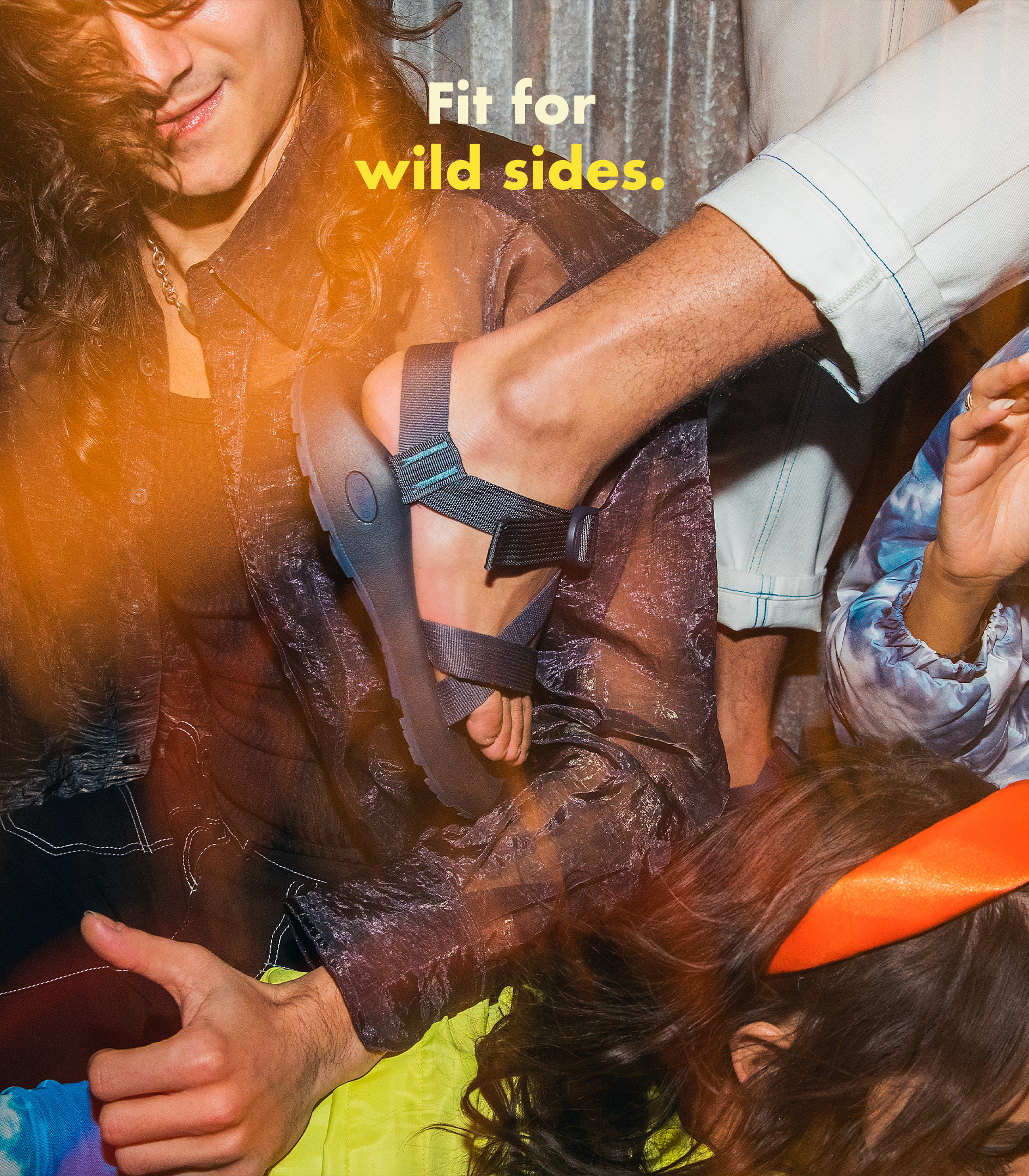

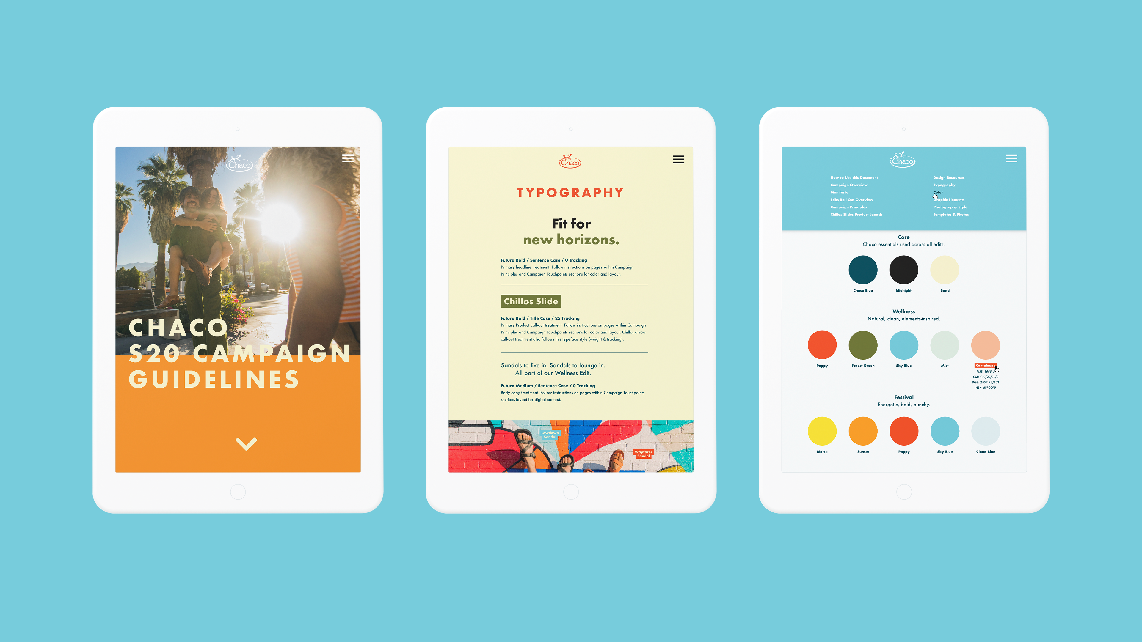
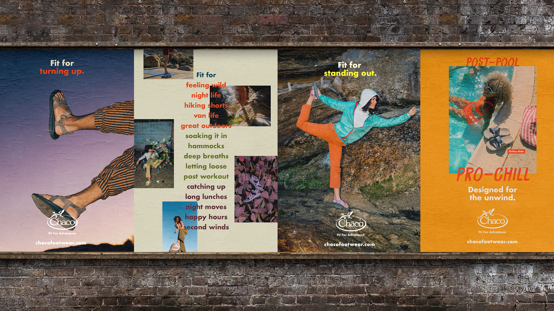
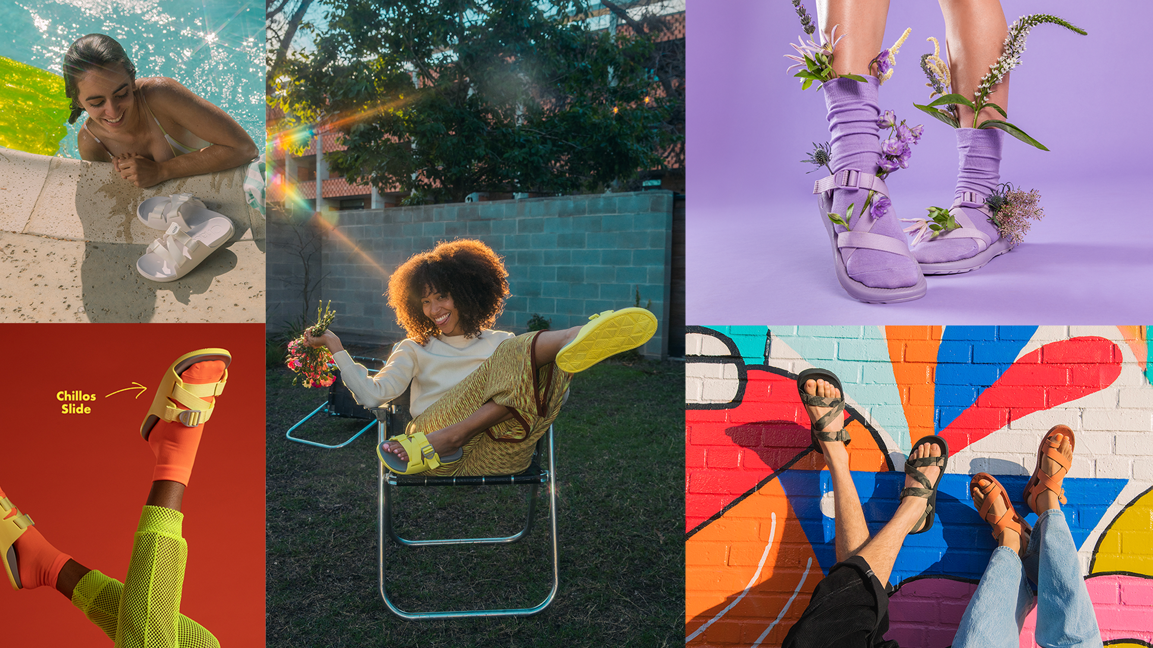

Working with a brand for years at a time creates the unique problem of slowly allowing the visual brand to evolve, and to inform tangential brand communications. The brand language developed for FFA represented a successful and strategic culling of Chacos’ existing brand language into a tighter system taking full advantage of the brand typography, color, illustration, and layout.


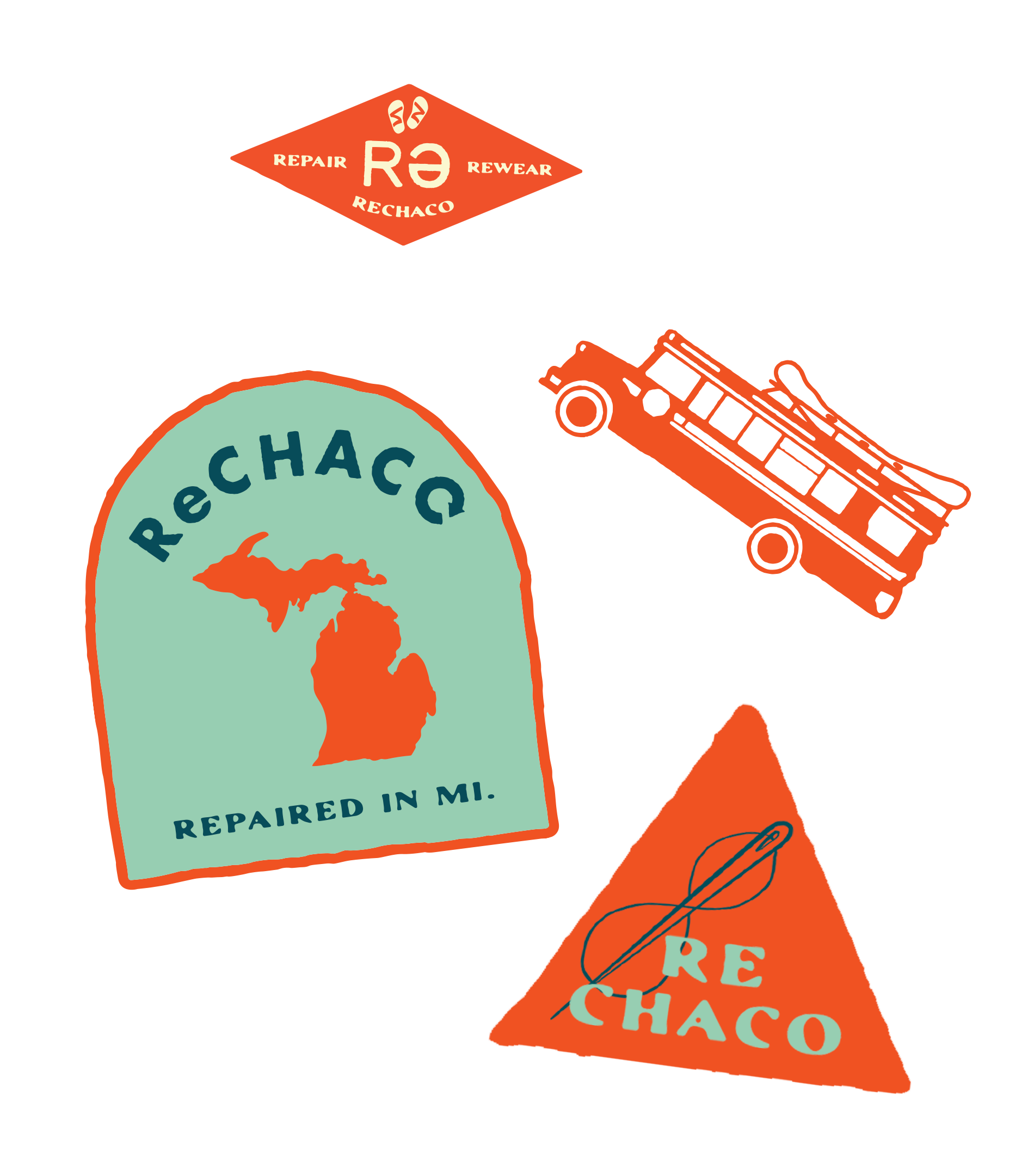
Rechaco follows a trend towards sustainability observable in a variety of major footwear and clothing maufactures. ReChaco is an incredible opportunity for storytelling, building strong relationship with consumers, promoting sustainable manufacturing, as well as creating jobs within their local community of Rockford, Michigan. The identity leans heaviliy into DIY aesthetics, such as the rough “painted” Future characters within the logotype. The brand language is meant to be playful and engaging, so we featured a number of patch designs and illustrations to expand the visual system.